Branding
TSF Radio
Scroll Down
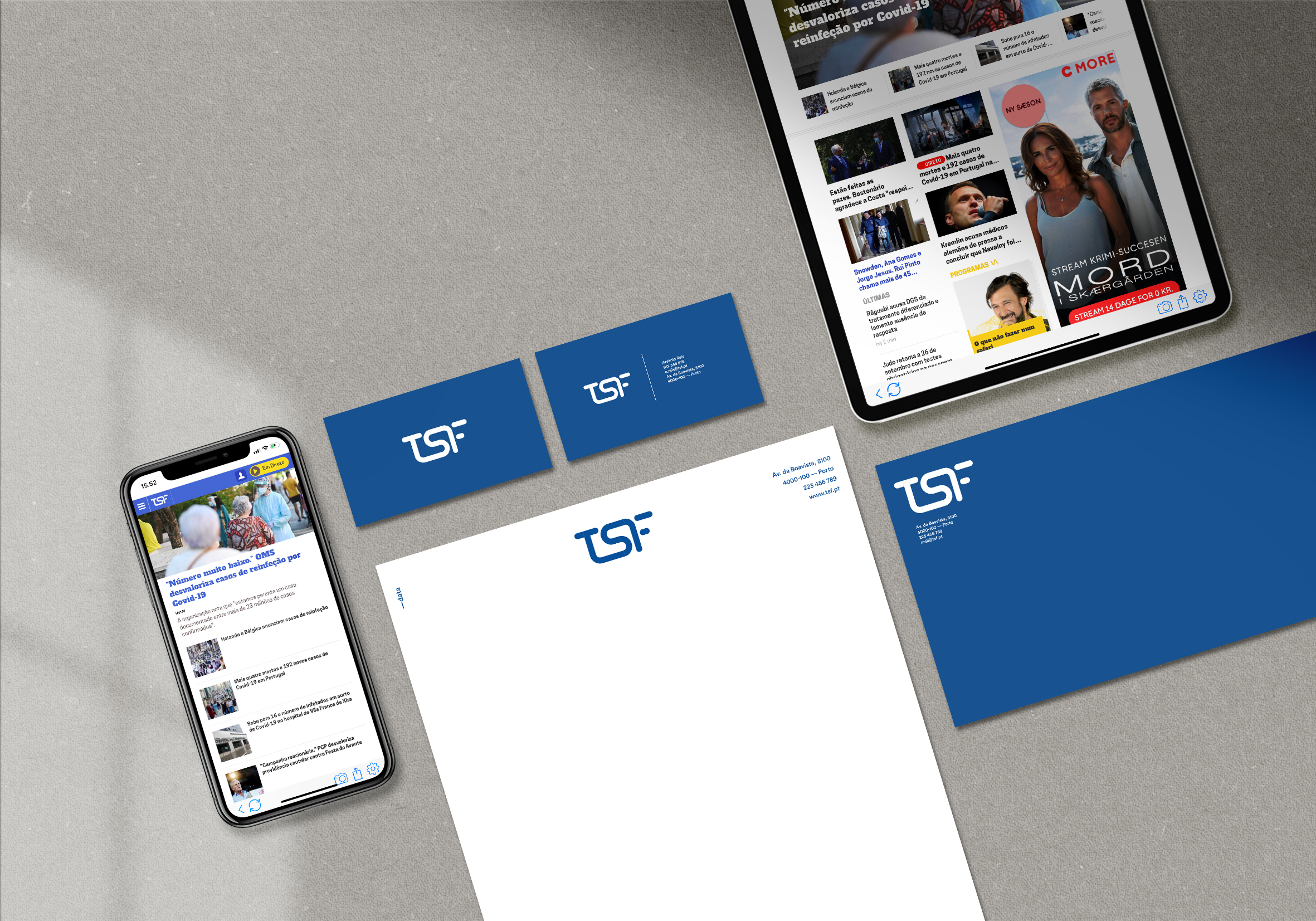
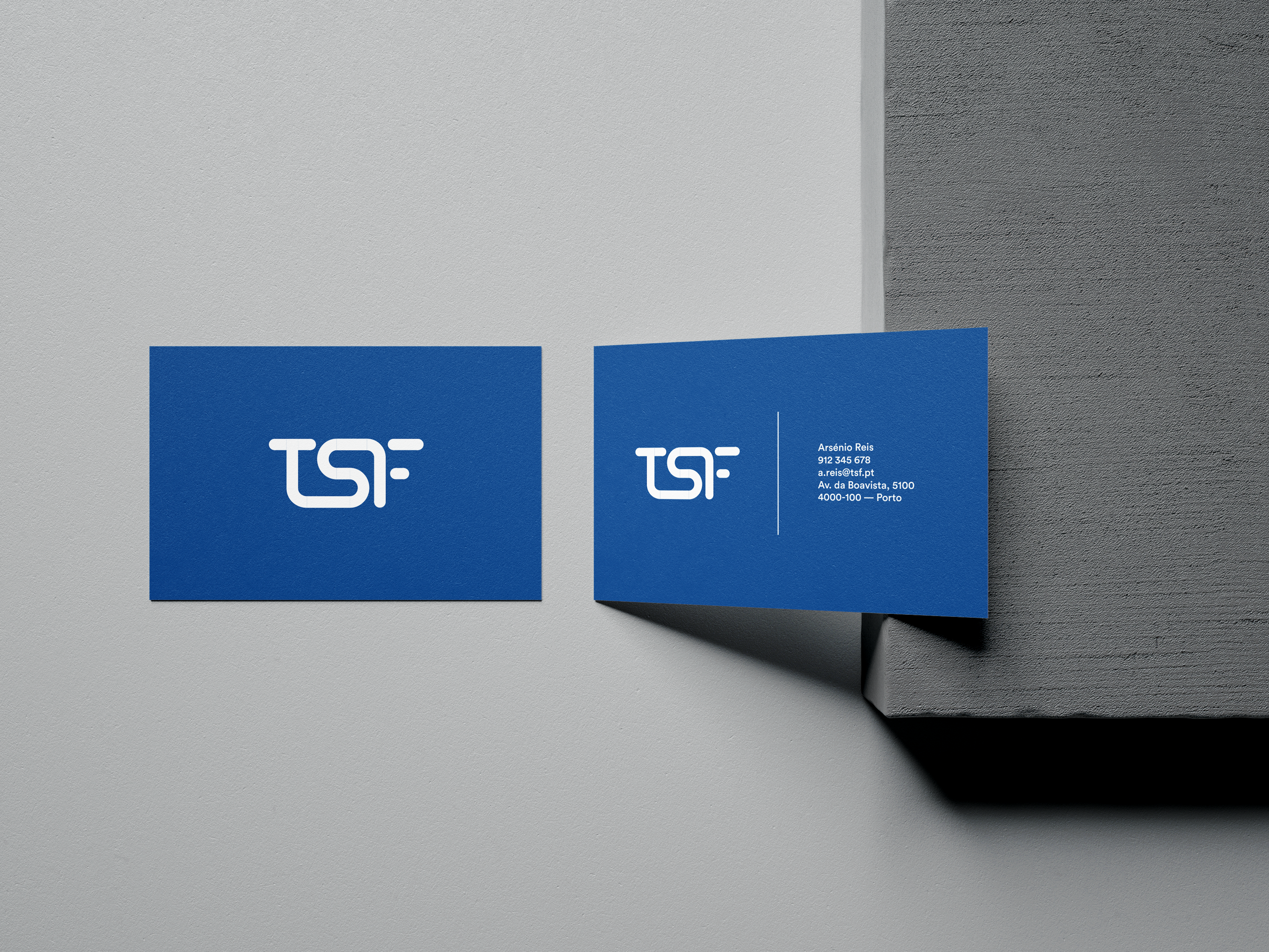
With more than 30 years of history, TSF is one of the most iconic portuguese radios. This non official re-branding aims to create an innovative identity emphasizing the connection that the radio creates with the listeners directly showed at the union of the three letters.
This non official re-branding aims to create an innovative identity emphasizing the connection that the radio creates with the listeners directly showed at the union of the three letters.
The minimalist approach intends to keep the visual language quite simple and with anything more than the three letters that compose the radio's name. Based on that I decided to remove the two words that were present on the actual version: Radio Noticias (News Radio).


This is the result of the new image for the his is the result of the new image for the app icon. It has a very clear lecture on this small size with great reading without losing the concept. This is the result of the new image for the his is the result of the new image for the app icon. It has a very clear lecture on this small size with great reading without losing the concept
